

2022
Typeface Booklet
As part of our Typography module at the National Institute of Design, we were expected to choose any typeface and study it, compare it with one of the typeface chosen by our peers and to finally compile it as a small booklet. This exercise helped me orient myself to type and well as appreciate the finer details of typeforms.


Inspired by the book 'Twenty-Six Characters: An Alphabetical Book About Nokia Pure' by Aapo Bovellan and Chris Merrick, I overlapped perfect geometric shapes and certain letterforms to observe various details like stroke width, contrast, symmetry, etc and compiled them in these layouts


We shuffled typeface names chosen by the class members and compared the two typefaces using our own ways of seeing. I continued the layering experiment, as I coincidently picked Gotham designed by Tobias Frere-Jones in 2000.
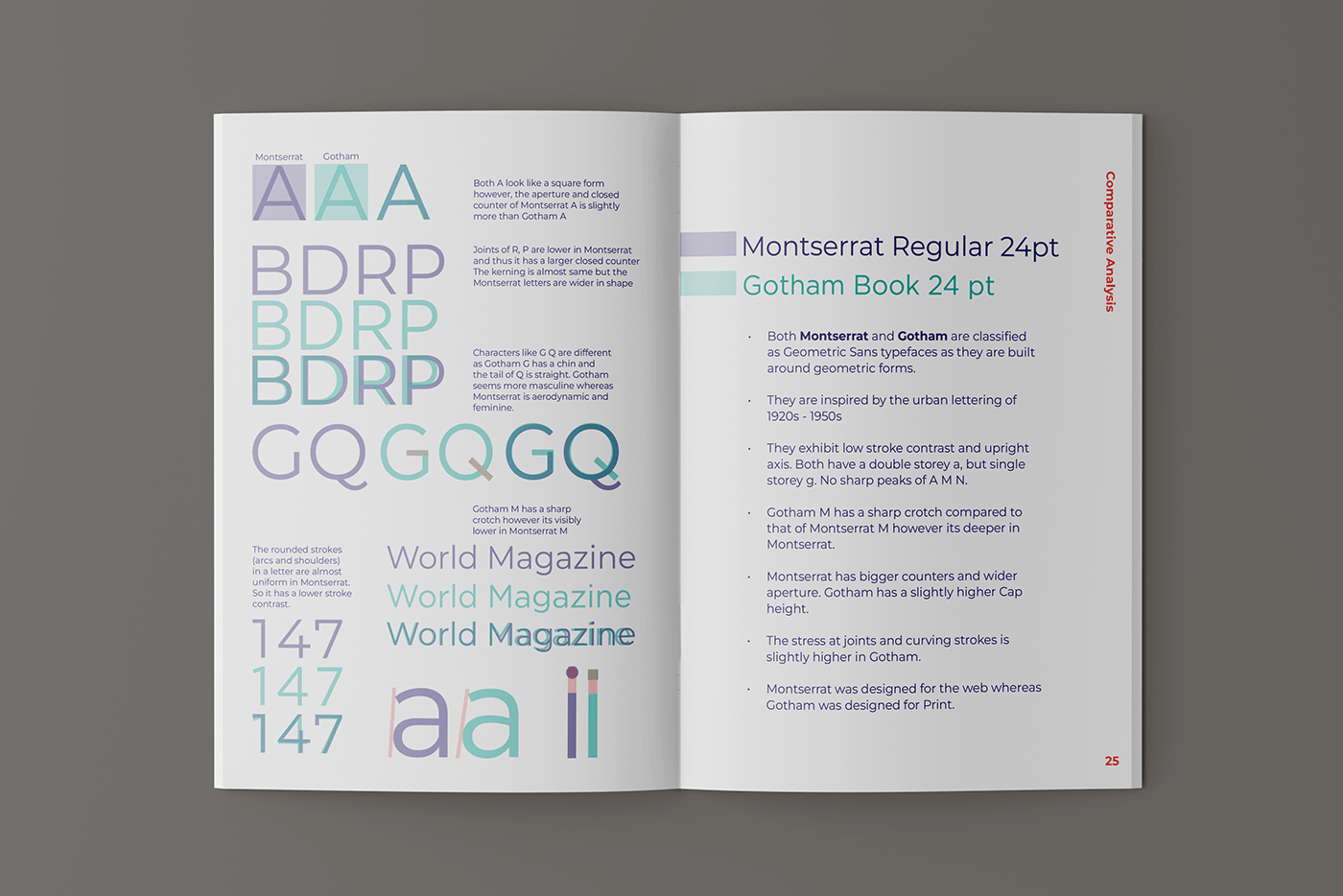
For the cover, I had initially submitted the yellow option, but owing to the strong sense of symmetry and personality of the font, I created another option in blue to be the final. The overall booklet was typeset in Montserrat using a consistent color palette.


